The Bones – For this space my biggest challenge was figuring out the door situation. With two doors opening into the space, it blocked a lot of the room for clearance, making that space unusable. The first order of business was to swap out the existing doors for pocket doors.
I think by now most people know I love WHITE. For this space I started it off by using Super White PM-1, which I find to be the purist white from Benjamin Moore, to set the stage for my spa like reno.
The Beauty – There is nothing like an amazing tub in a bathroom to set the mood. I sourced the most beautiful freestanding tub, matte black sleek faucets and easy to install glass shower from Bath Depot; it was a one stop shop for all the bathroom must haves. I also love that they are a Canadian company as I love to support local. I really wanted to add a floating sink and faucet off to the side, which I was also able to find. And you can not forget about the toilet, the main functionality in any bathroom, and an eyesore most days; however, I went with a thin, sleek profile that faded into the design and allowed everything else to stand out, a true unsung hero.
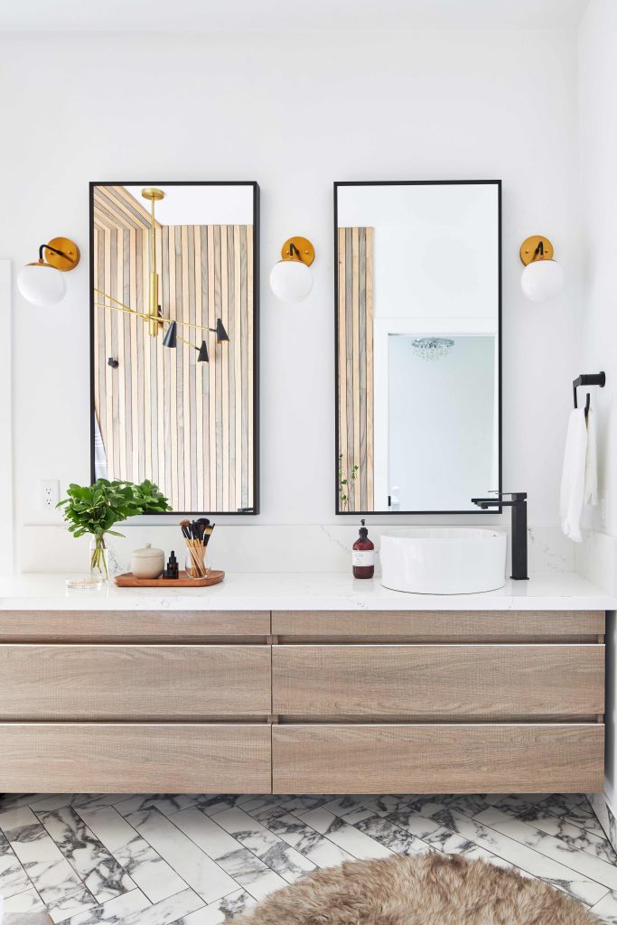
When it comes to vanities, I prefer more counter space than sink space. The space allowed me to add a long vanity, which gave me more working space and storage. I put two vanities together for a custom feel, creating both the look I wanted and fitting the space perfectly. I established separation of the zones by adding two mirrors instead of one.

I have said this before and I will say it again…when it comes to countertops, forgo a DIY and turn to the professionals. I went with Chantilly from HanStone Quartz , a modern classic with feathery charcoal veins set against a crispy white background. Once the counters were chosen, I worked with Stone Edge who measured, templated, and installed this gorgeous countertop for the custom look I wanted to create, spanning both the vanities to create one long, seamless countertop and then adding a four-inch backsplash to match.
Tiles are a big part of a bathroom design concept and can truly set the mood. I knew I wanted something masculine with drama, yet elegant at the same time. M2 Tile & Stone had the perfect bold marble-inspired porcelain tile, the New Arabescato Series, that I used throughout. I went with the 24” x 48” large-format tile for the walls and used the 4” x 24” size to create a modern herringbone look on the floor and complete the dramatic yet serene effect.
The Bling – For the final touches, and to create the spa feel I was going for, I partnered with Bed Bath and Beyond to find everything I need to create my at-home spa bathroom. I installed three of the globe sconces from Bed Bath and Beyond to be placed between the mirrors for ideal lighting. I also found this STUNNING ceiling light to hang over the tub in the most perfect hues of black and gold – it is a showstopper in this space. I chose white blinds to further compliment the space. Finally, I outfitted the room with fluffy white towels that further create the spa look and feel.
All together, the elements in this space create a luxurious, spa feel without ever having to leave home.
With over 15 years experiences as a celebrity interior and home product designer, expert instructor, corporate ambassador, and TV personality, Jo had created a fabulous fan following. To add to credentials, she is a style editor & writer for multiple publications and blogs, a public speaker, and a avid animal environmental advocate.