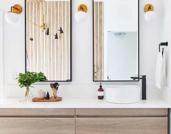
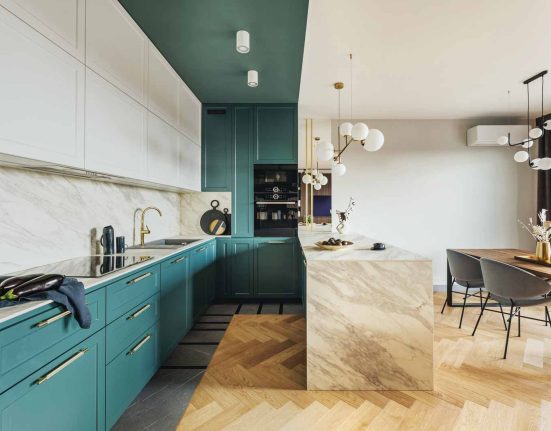
I was ecstatic when not only did my clients want me to complete demo their space, they also gave me cart-blanche on the entire kitchen design!
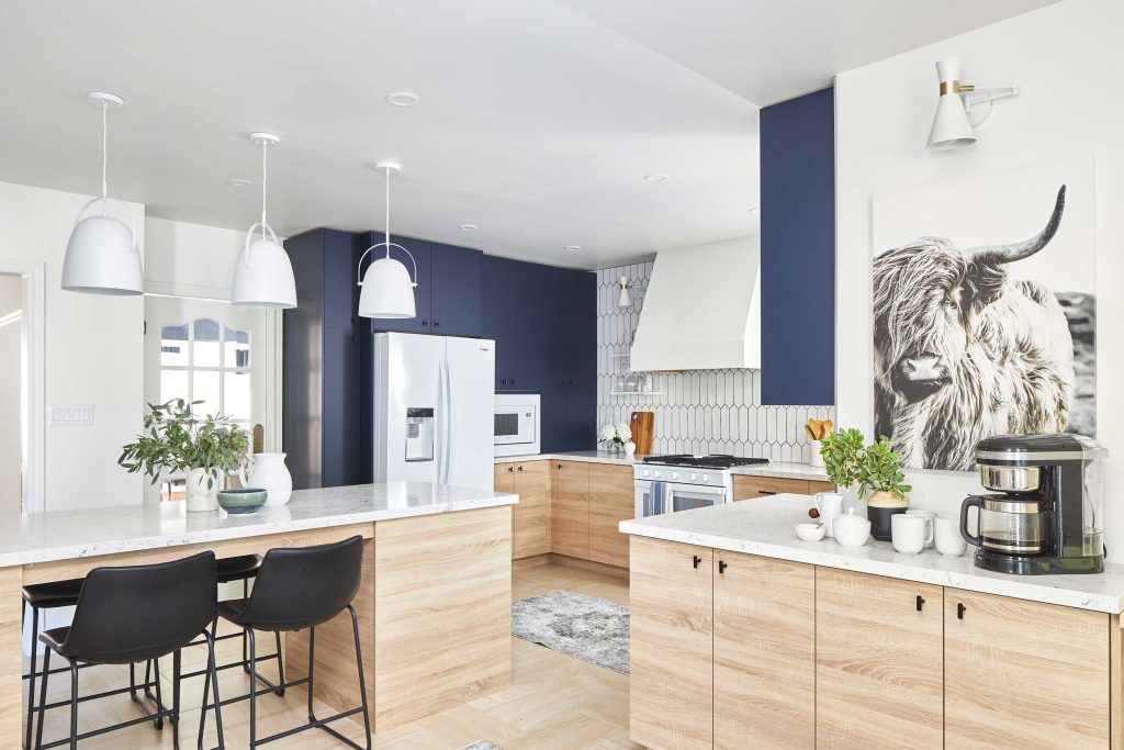
We started with switching up the entire layout of the kitchen and cabinets. I went with a sturdy ¾” wood-grain lower to tie in the floor colour, while the uppers were created in a dark, solid blue to create a dramatic contrast. Delightful details from this company included the softest closing doors and corner doors that open wide so you can access hidden nooks.
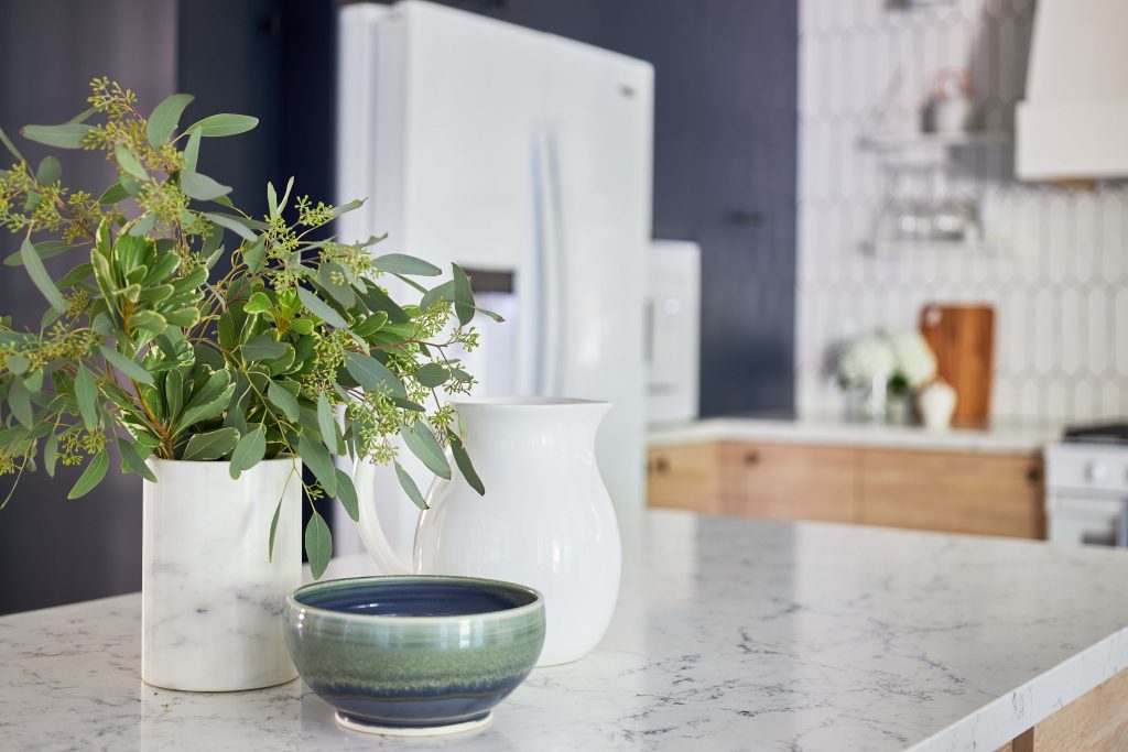
Next up were the counter tops. I couldn’t resist the White Attica by Caesarstone that is primarily white but has a marble ribbing through it that matches the uppers perfectly. It’s elements like this that help bring the entire space together.
When going with a material like quartz you want to ensure that you have it professional installed. This is not a time to try your hand at a DIY, leave it to the professionals. For this installation we worked with Stone Edge Marble and Granite to manufacture and install the counters that they fit perfectly.
To brighten up this space we chose the colour Dove Tail from Benjamin Moore. We painted all the walls, trim and even the celling in the same finish to create a brighter space.
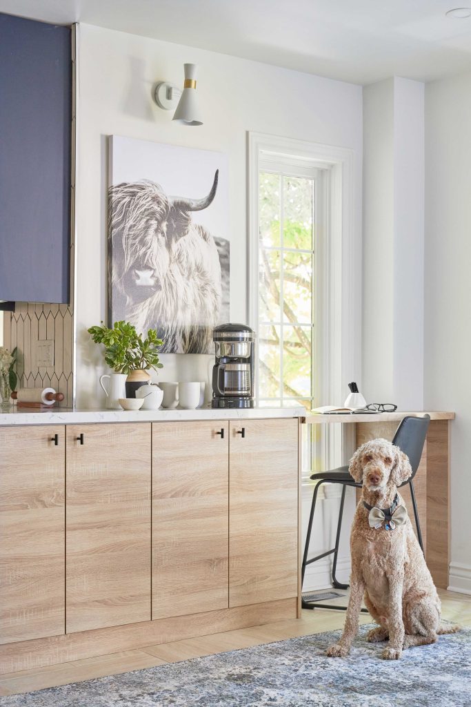
A feature that might not always be the center of attention in a kitchen is the sink – that changed with this space. I chose an edgy farm sink from Wayfair Canada that really takes center stage. What people might not know is that Wayfair Canada has thousands of affordable renovation must-haves that can be delivered right to your door.
Another sexy element I brought into this kitchen was this sleek black faucet from Delta. It’s the Pivotal Single Handle Exposed Hose Faucet that includes a powerful magnet to snap your faucet spray wand into place and hold it there. It’s truly a gem in this gorgeous space.
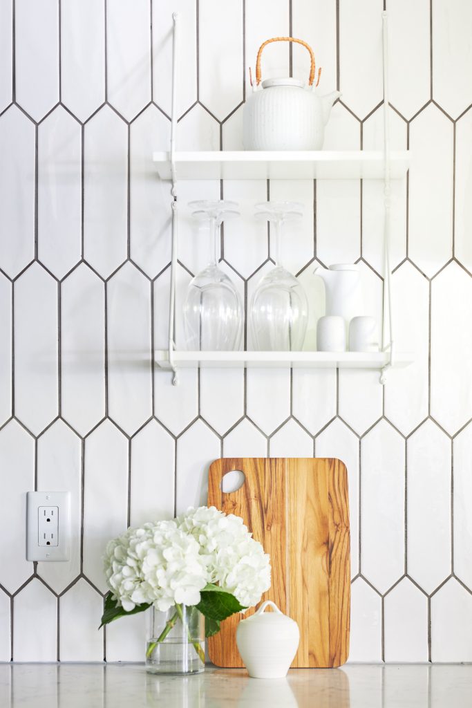
In this space I opted to do NO cupboards on the back wall so I could do the entire wall – counter to ceiling in this gorgeous wall tile from M2 Tile & Stone. Their tiles are sourced carefully from premium European suppliers and kept in stock locally. I also opted to have the tiles laid vertically to truly show up the tile details and elongate the wall. To make the tiled wall really stand out, I added some gorgeous sconces from Wayfair. White with a touch of gold was the exact tone I was going for.
Now for the stunning finishing touches we shopped at Bed Bath and Beyond Canada to find the perfect accessories. What I love about shopping with them for a kitchen makeover is you can find everything you need in a one-stop-shop. We chose low back black stools that are super comfy and tuck tightly into the island to give more space surrounding the it. Perfect throw pillows, cutting boards, cute sugar bowls and tea pots complete the look on the open shelving.
With over 15 years experiences as a celebrity interior and home product designer, expert instructor, corporate ambassador, and TV personality, Jo had created a fabulous fan following. To add to credentials, she is a style editor & writer for multiple publications and blogs, a public speaker, and a avid animal environmental advocate.


