After spending countless hours looking online and creating dream worthy inspiration boards, you are ready to tackle a home project! You get to work, purchase paint, materials and furniture – time to roll up your sleeves. After putting the finishing touches on your space, you stand back to admire your hard work. But something seems off. Your space doesn’t look like what you had envisioned. Here are a few common design mistakes that could be contributing to your space not matching what you had pictured.
DO! Declutter before Redesigning
It happens to the best of us, we get this sudden urge to redesign our home with some new found energy and enthusiasm, so we dive right in! Problem is, you haven’t taken the time to take stock of your existing pieces or the space itself in a raw, uncluttered form.
By taking time to clear out the room and declutter the items, it allows you to have a better understanding of what is required within the space to achieve your vision. Always declutter first before assessing a project!
DON’T! Pick your paint colour(s) first
It is common to select your paint colour(s) first as a starting point to inspire for the other elements in the room. Stop! I urge you to leave this until later in your project! By selecting paint colour first, you are putting your space in a narrow box, limiting the potential options for key items, such as: furniture, artwork or accessories.
There are hundreds of potential colours to pick from, but there are not as many furniture options with the right scale and shape for your space.
DO! Test your paint colour
When you finally select a paint colour, make sure you test the colour in various parts of the room before committing. Lighting can impact the undertone of the colour, potentially affecting the final result on your walls. Paint a few test spots In the room and look at it for a couple days in the space before making your final decision.
By taking time to clear out the room and declutter the items, it allows you to have a better understanding of what is required within the space to achieve your vision. Always declutter first before assessing a project!
Marissa Warner
DON’T! Include too many colours
The best way to create cohesiveness throughout a home is to select a limited amount of paint colours, ideally 3-4 complimentary colours in total. A common mistake is to look at each room in isolation, rather than sticking to the colour palette you have created for your home.
The dedicated colour palette is the reason why professionally designed homes feel connected and fluid as you move through them.
DON’T! Push furniture up against walls
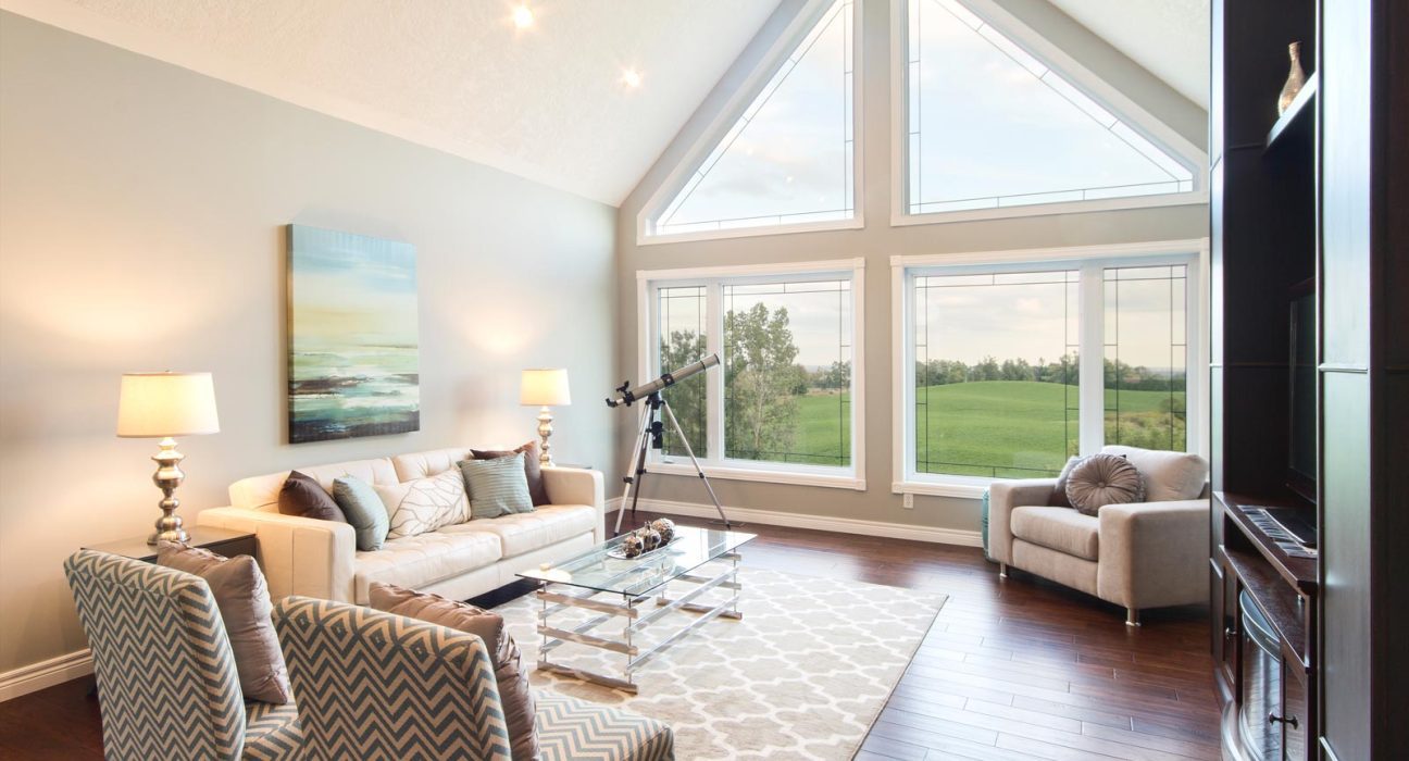
It happens all the time, each piece of future is pushed up against the wall to help make the space feel larger. By doing this, your space quickly feels disconnected and unwelcoming to guests. Try pulling out pieces from the wall throughout your home to add dimension and a less ridged atmosphere.
DO! Hide your cables
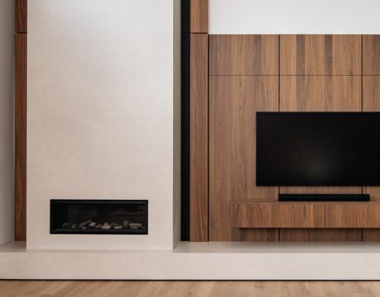
Have you ever noticed in a model home, on home tours or in magazine photos, cords are nowhere to be found? It is on purpose; cables are an eyesore! When designing your space, make sure the placement of furniture, lighting and electronics take into consideration the power source. If your room has an ideal layout but you are missing an outlet or two, it is worth contacting an electrician to add additional receptacles.
Redesigning any space has many elements to consider and initially can be overwhelming.
Taking your time to consider every element will save you both time and money long term, as you will be less likely to change your mind or redo an area through or after your project.


